Premier Inn UK/Global Replatforming & Improvements
Premier Inn UK/Global Replatforming & Improvements
Premier Inn is a household name in the UK, operating over 800 hotels and serving millions of customers every month. While the brand is known for reliability, the digital experience was held back by an outdated in-house system from the early 2000s. When the company decided to move to a more modern platform called Opera, it created a perfect opportunity to completely rethink and elevate the booking journey on their website.
As the Senior UI/UX designer, I was responsible for the entire design process, from the initial research and conceptual thinking to the final, polished execution. My goal was to turn a functional but clunky interface into a best in class experience that felt as welcoming as a stay at one of their hotels.
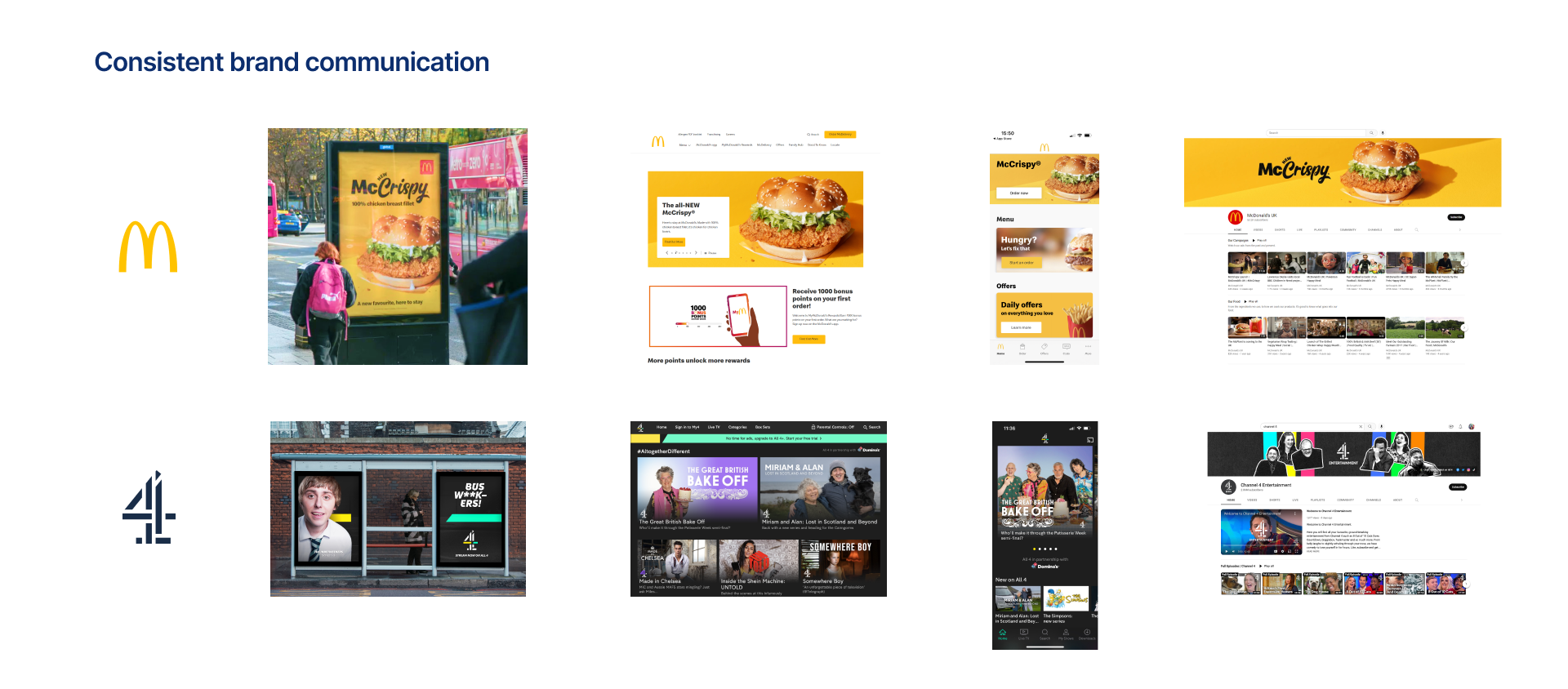
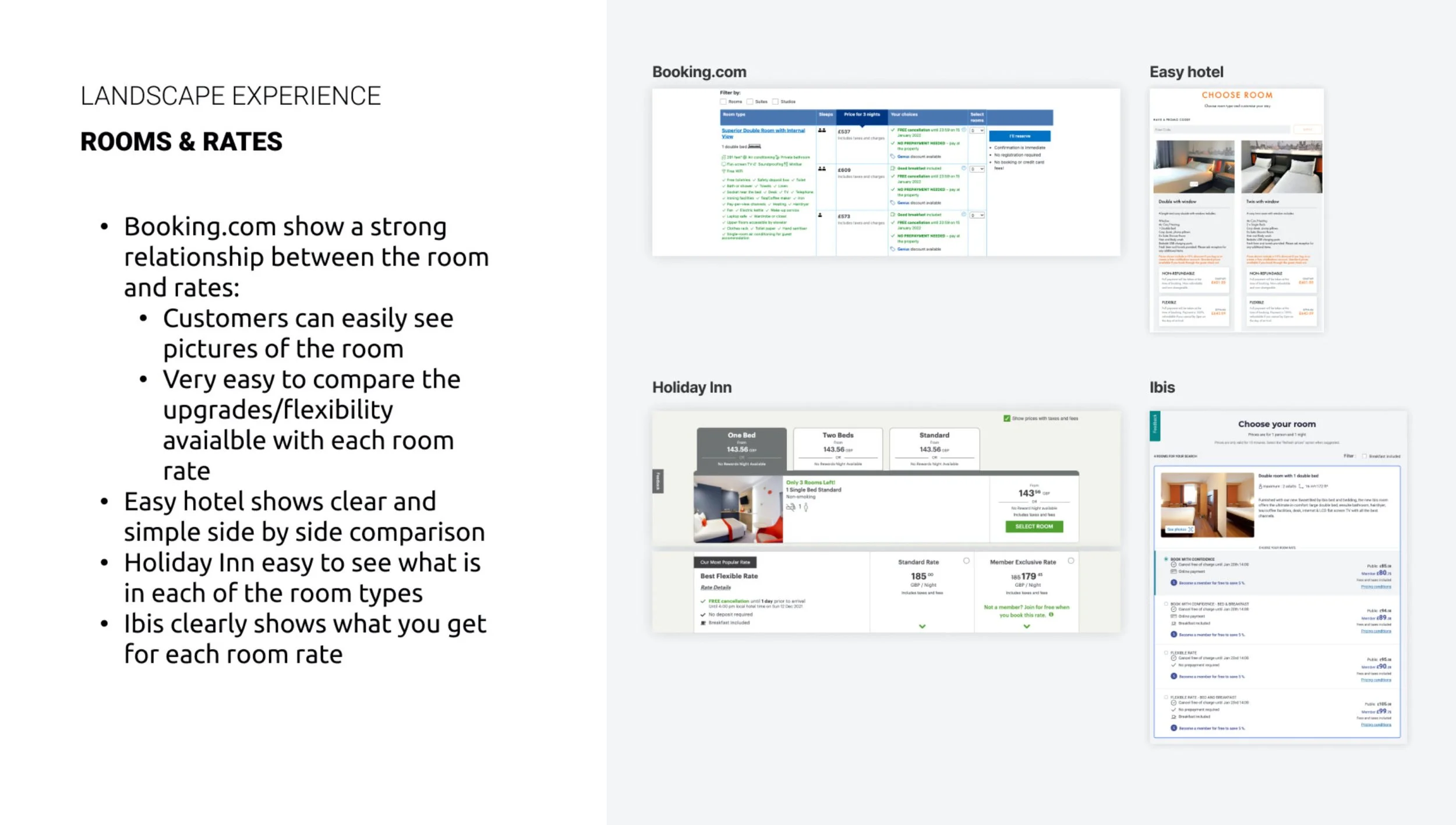
Competitor analysis allowed me to identify the best practices and find solutions for potential gaps Premier Inn had. Not only we looked at PI competitors and the industry of hospitality, but also looked at industry standard brands in general.
To understand where the website was failing customers, I started with a deep dive into the existing experience. This meant looking at the desktop site and the app, but also speaking with the people who hear about customer frustrations every day: the call center agents and hotel staff. By mapping out the customer journey, we identified three main areas that needed urgent attention: how people compare rooms and rates, how they add extras like meals, and how they change or cancel a booking.
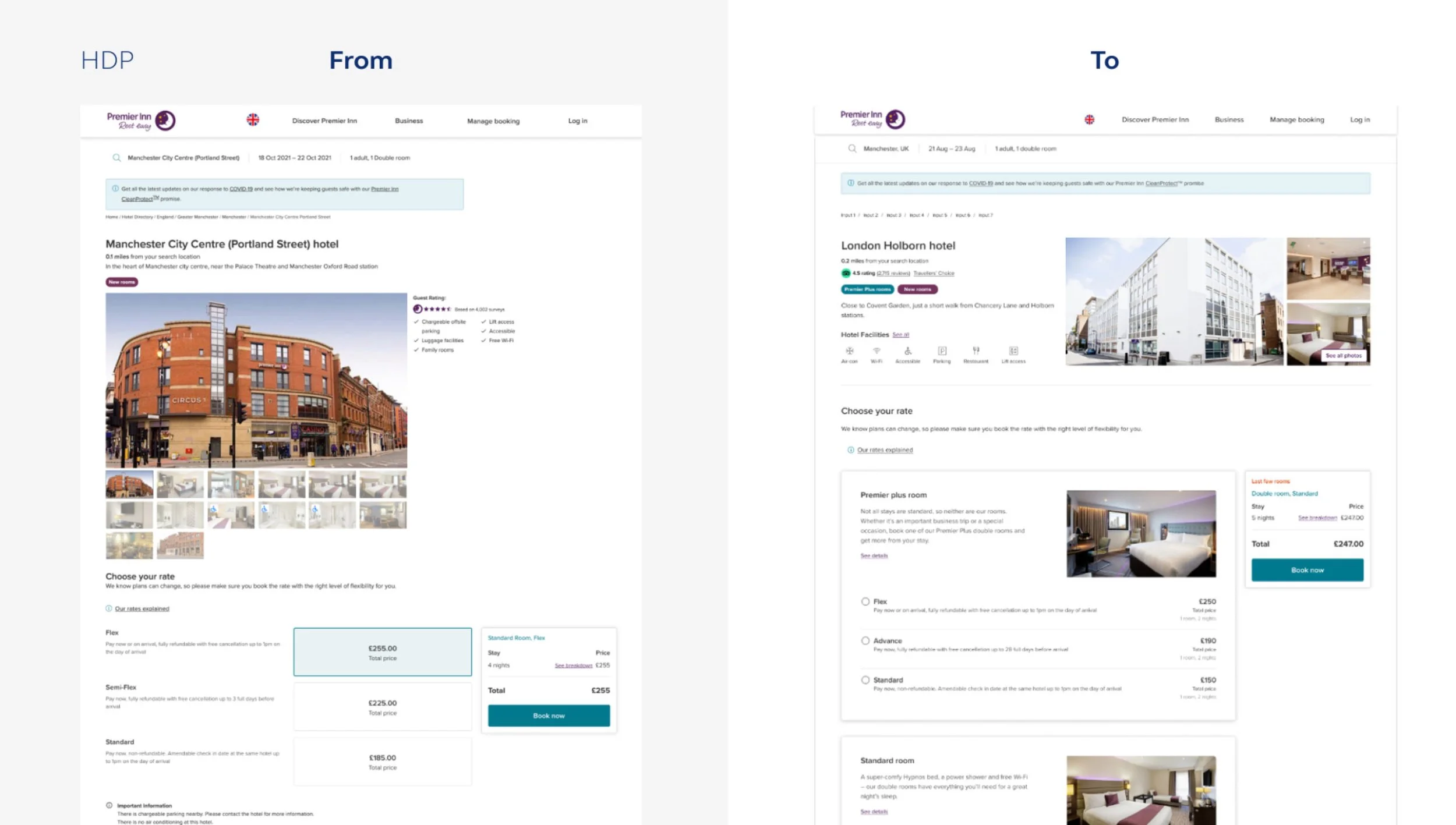
One of the biggest issues was that guests couldn't easily see why one room cost more than another. The relationship between the price and the service was unclear. Additionally, the hotel details page had a massive header that forced the actual booking options way down the page, meaning users had to scroll just to see the prices. I redesigned the layout to bring the rate grid above the fold, making it the first thing people see. I also restructured the grid to clearly highlight the differences between offers, ensuring guests understood exactly what they were getting for their money.
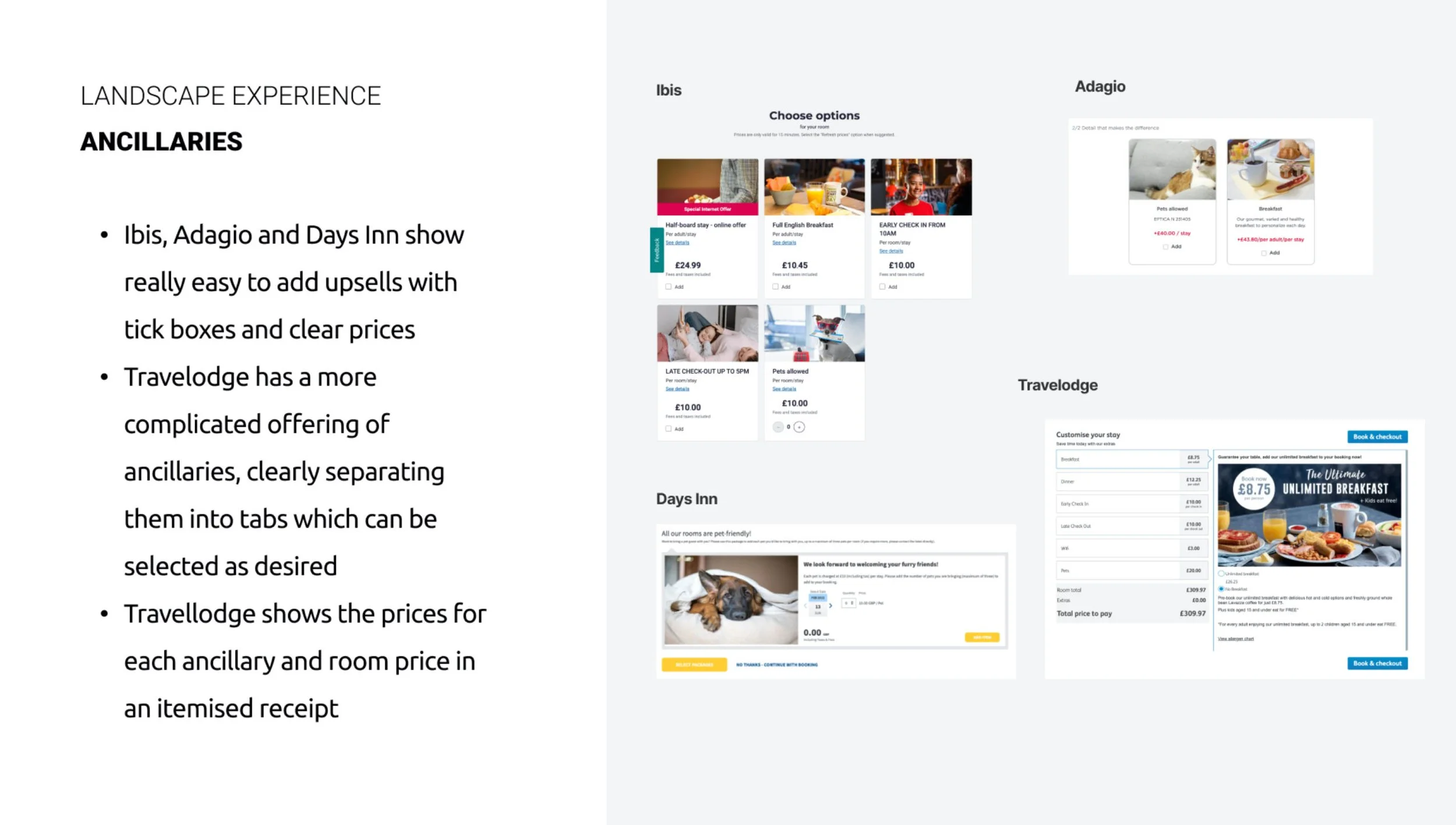
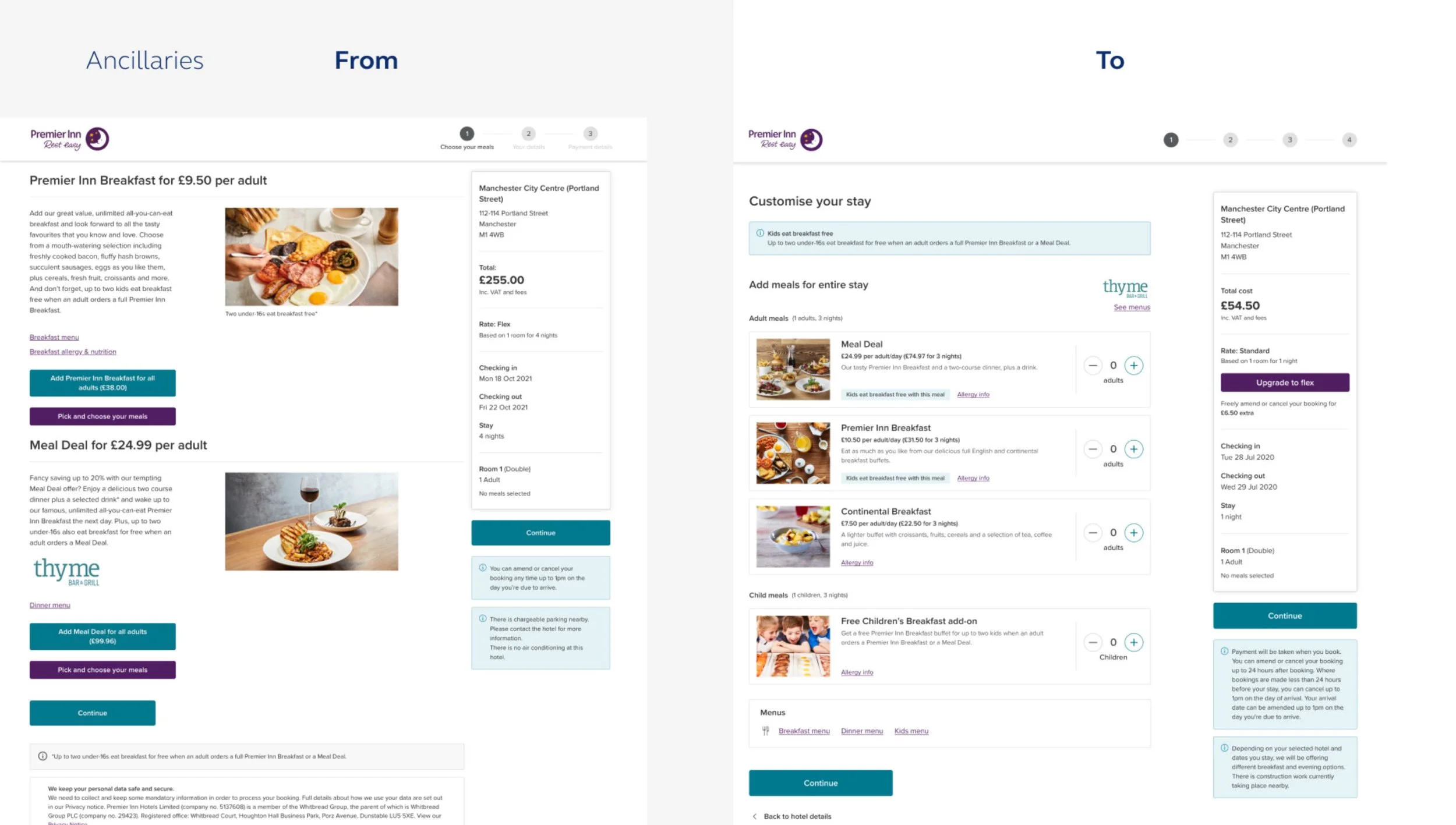
The page for adding extras, like breakfast or dinner meal deals, was originally quite overwhelming. The layout was messy, and the pricing was hard to follow. To fix this, I introduced a clean card based system that used better visuals to make the options more appealing. I also focused on making the process more flexible. Travel is personal, so I updated the system to allow guests to choose different meal plans for different people in the same room. I also made sure to include clear allergy information, which is a small detail that makes a massive difference for guest safety and peace of mind.
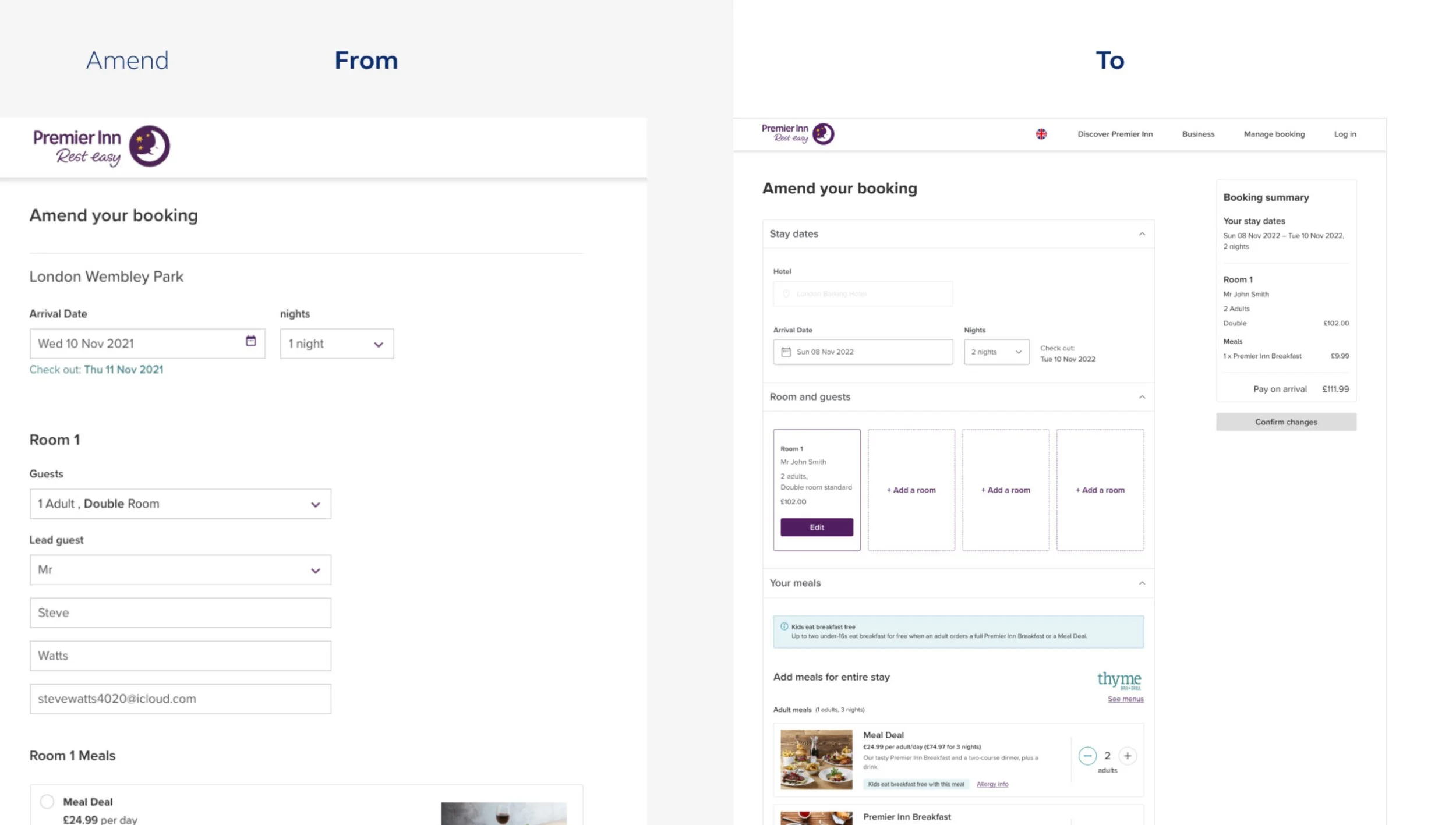
In the past, guests had very few options if they needed to change their plans. In a world where travel flexibility has become a top priority, the old system was a major pain point. I designed a new experience that gave customers total control. They can now cancel a stay or modify almost every detail of their booking, including dates, the number of guests, their meal choices, or even the hotel itself, all without needing to call support.