Premier Inn Mobile App - Case Study
Premier Inn Mobile App - Case Study
Having worked at Premier Inn from 2021 to 2024, I have a deep understanding of how the brand operates and what guests expect when they book a room. During my time there, I noticed that while our hotels were top tier for value, our mobile app was lagging behind. It functioned more like a basic website with a lot of inconsistencies than a helpful travel tool. For this project, I used my experience to create a more modern version of the app for 2024 without losing the look that the current customers were accustomed of.
I began with an internal audit of our digital platforms. This audit showed that the mobile app and desktop site were using different UI components and navigation patterns. One major finding was the inconsistent use of our primary call to action buttons. The app was using a specific yellow for conversion, which was a legacy color brought over from the brand’s legacy offline designs and print materials. While this yellow was intended to drive conversions, it was creating an inconsistency since the newest Premier Inn hotels started using the primary purple and primary green for their offline designs.
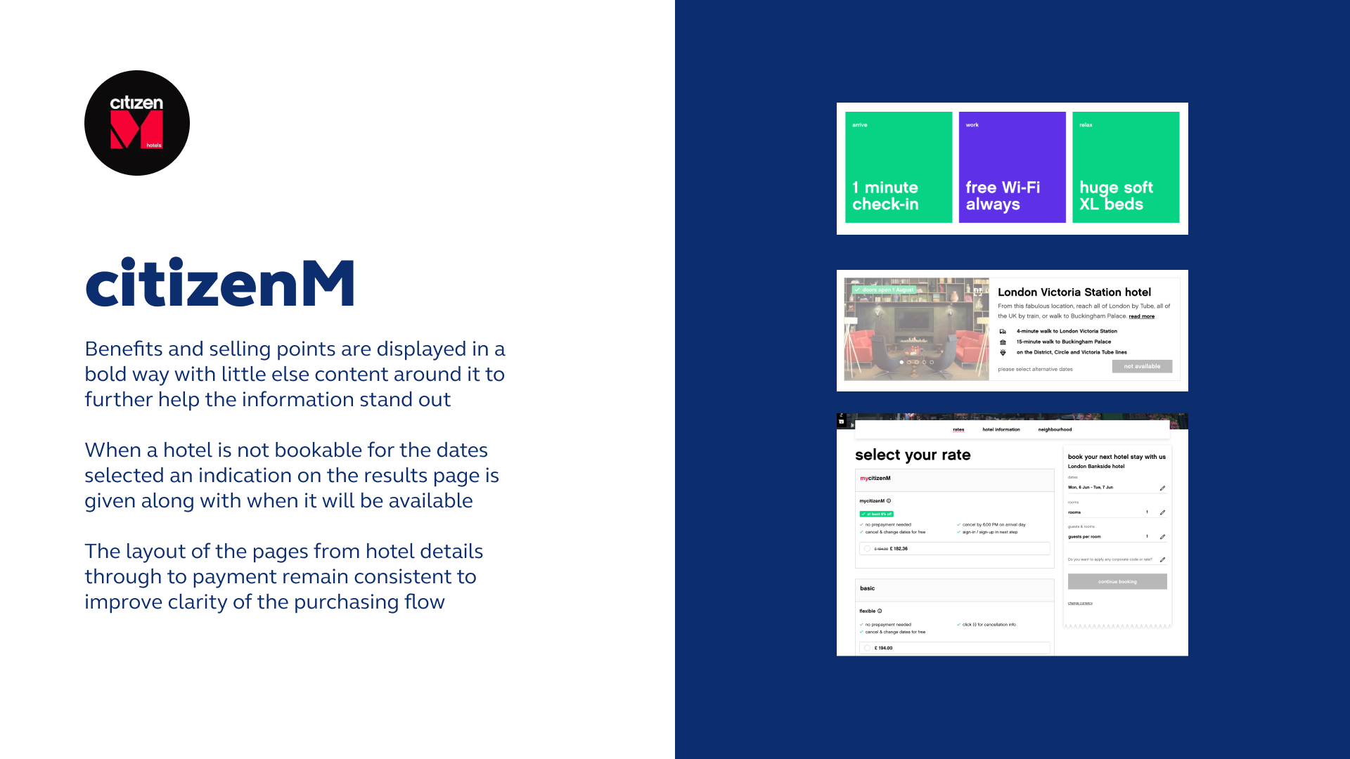
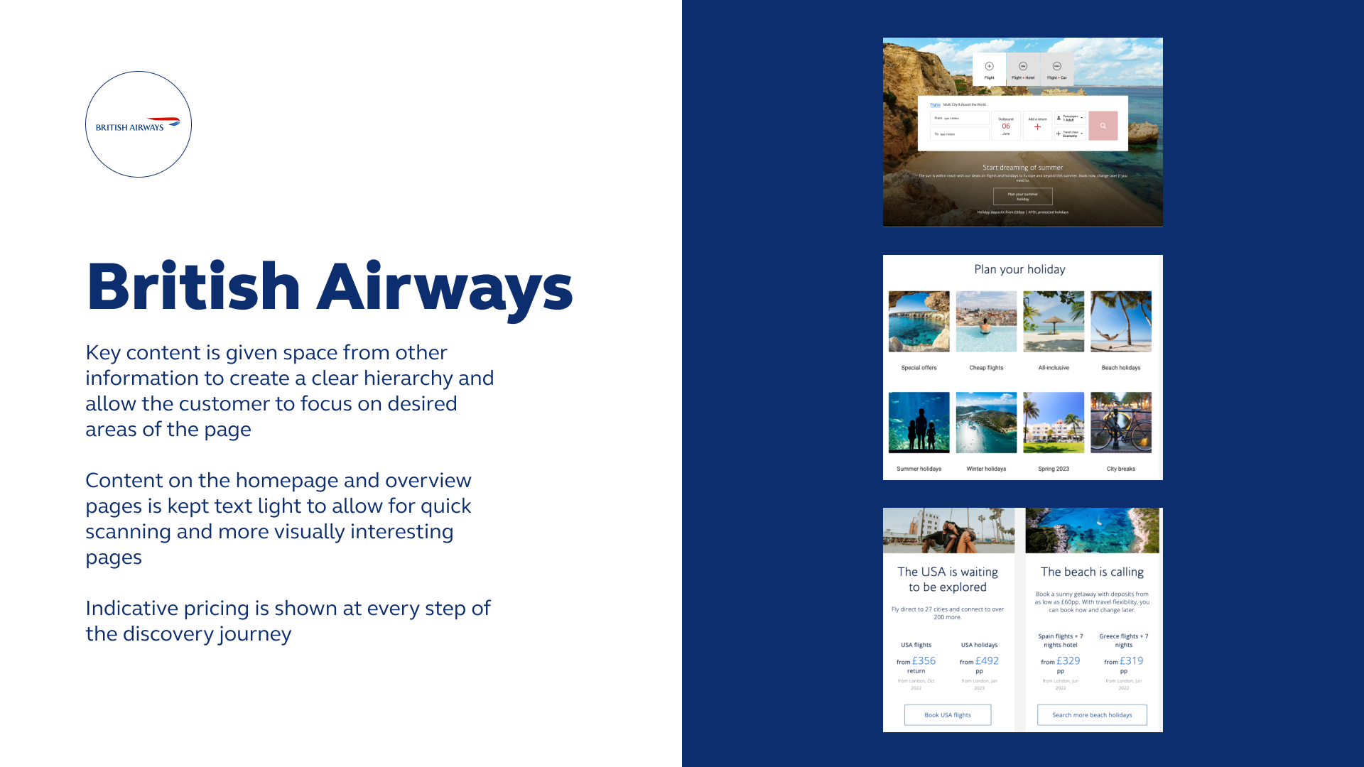
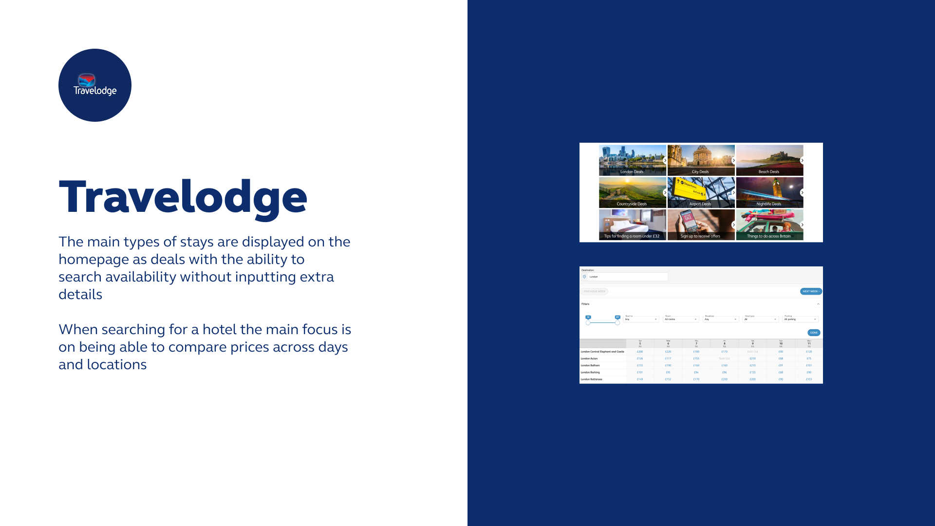
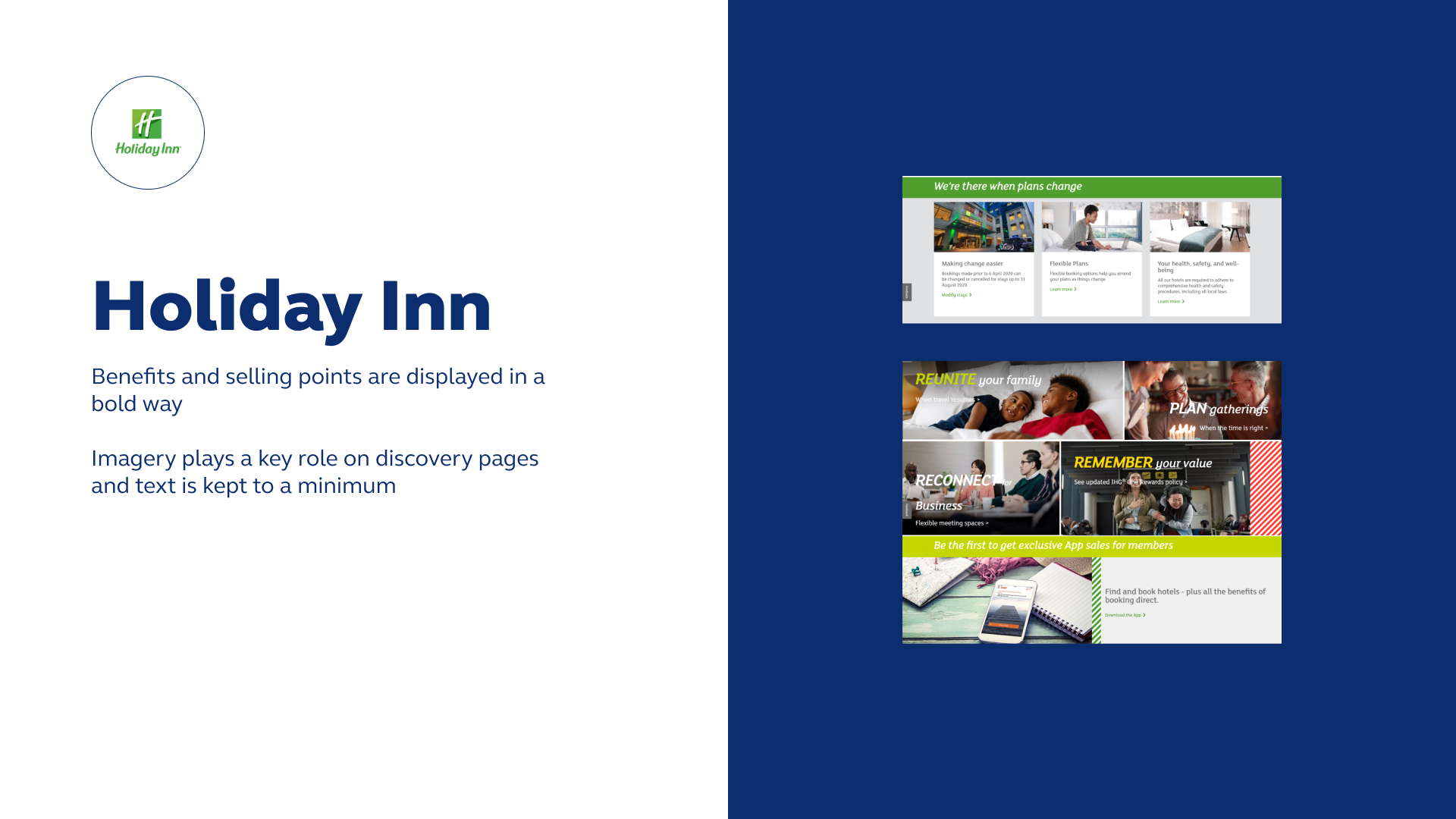
I conducted a landscape analysis of other major hotel brands and competitors such as Travelodge, Holiday Inn, British Airways and more. At first glance, we found that Premier Inn was lacking things like highlights, key contents, selling points, clarity and consistency.
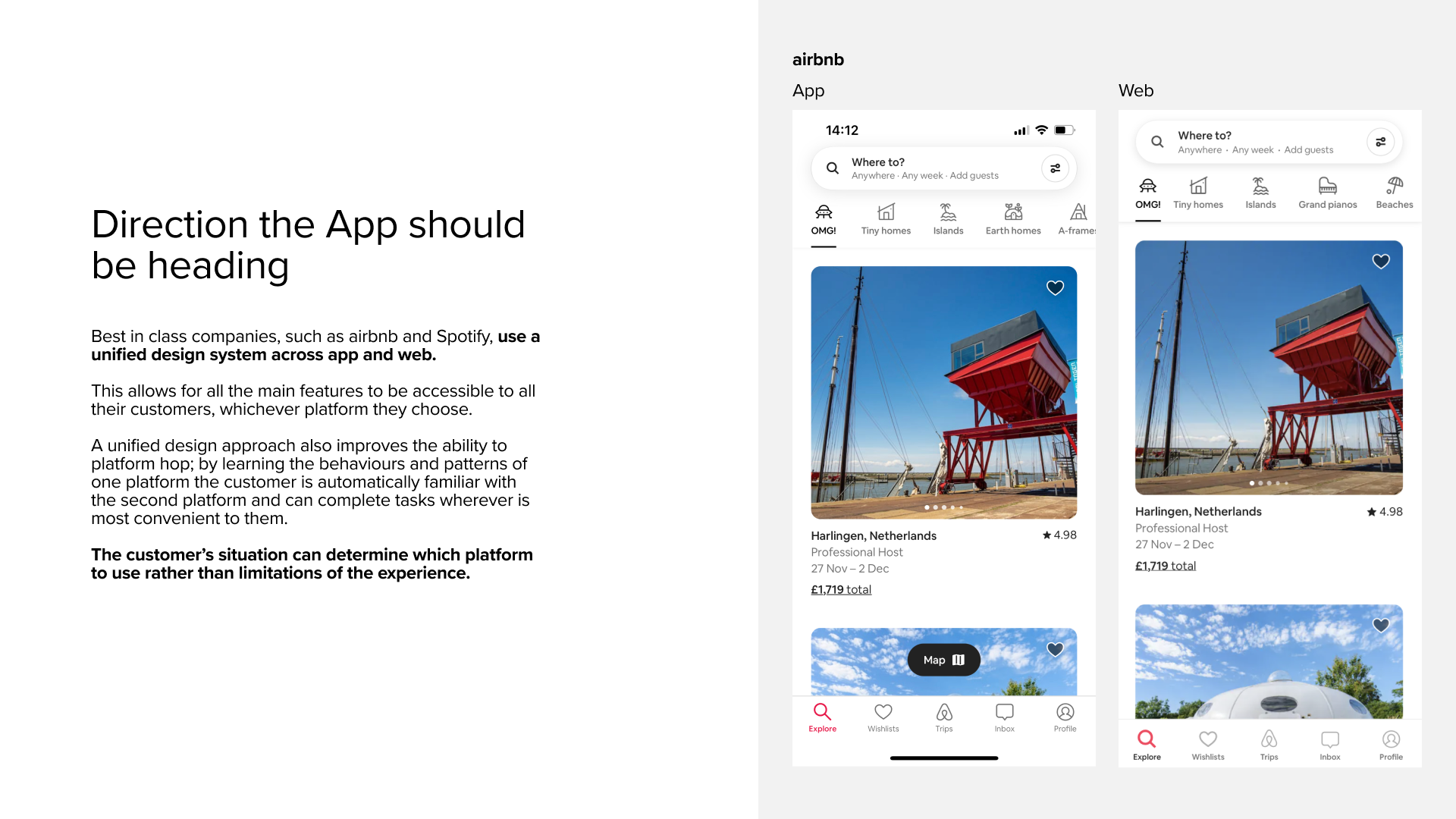
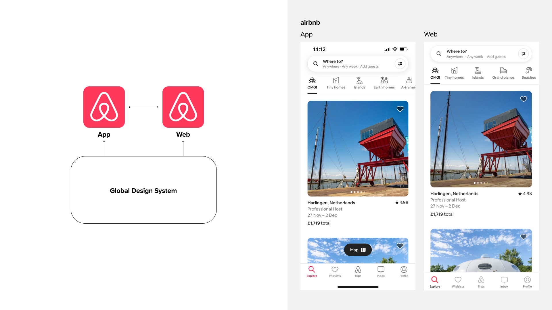
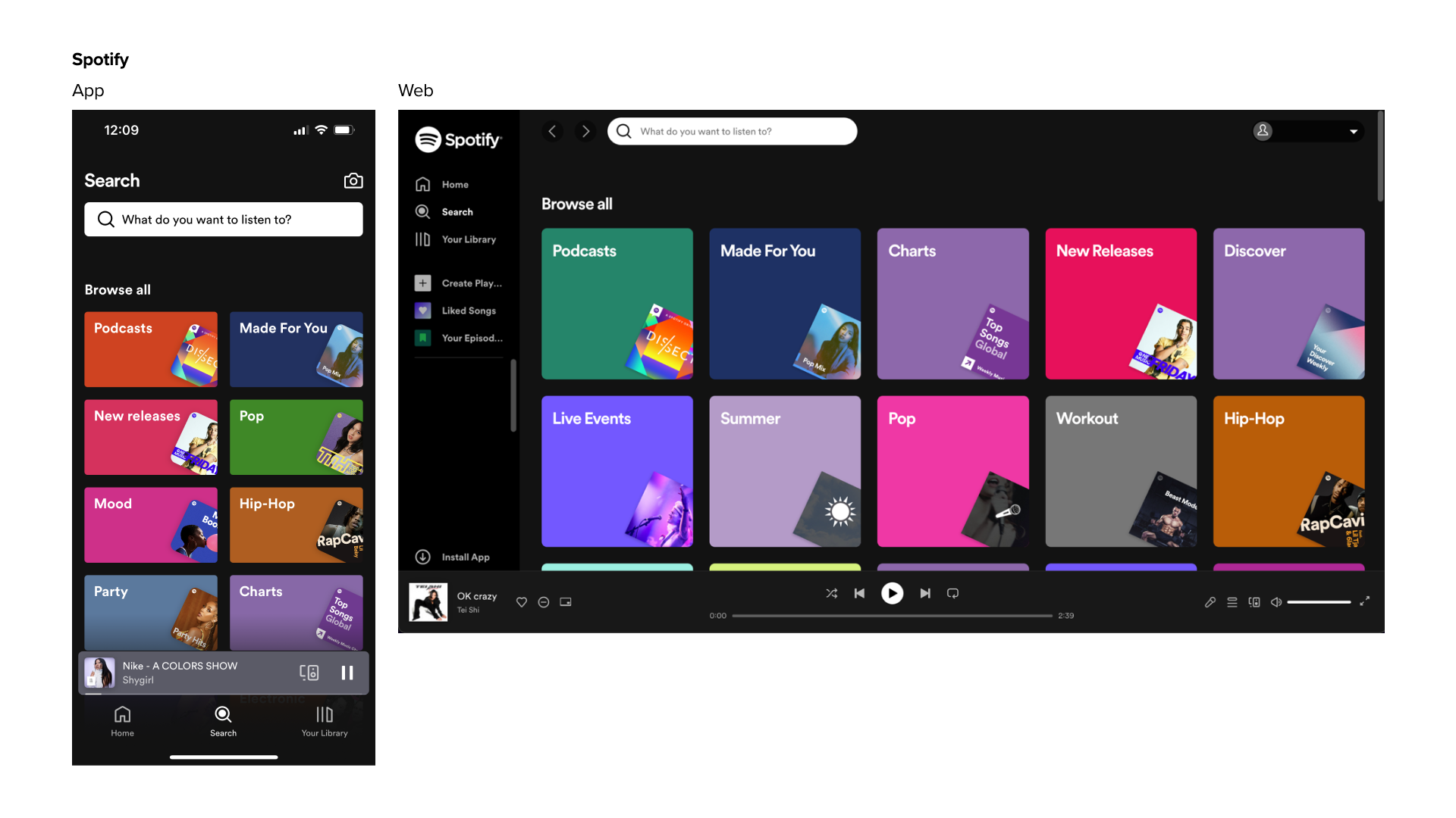
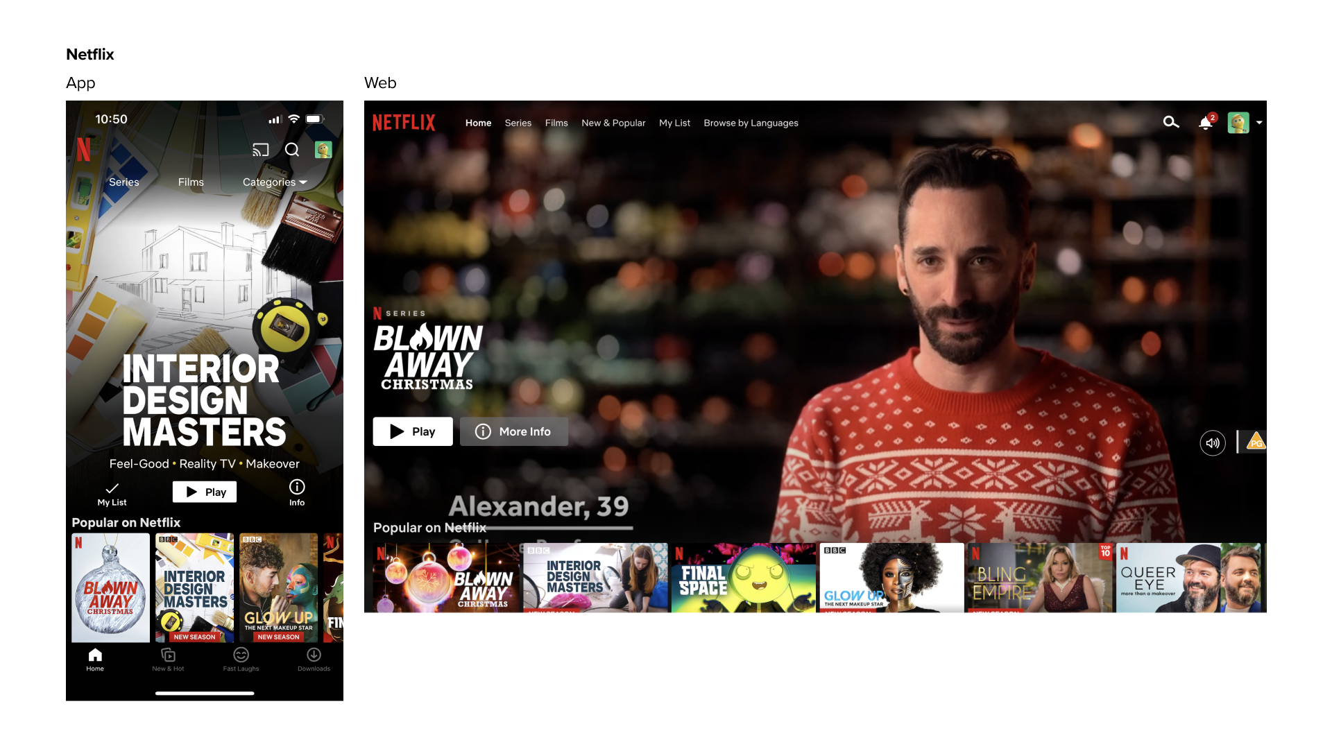
We looked at best practices for apps within the hospitality world and also in other industries. The holistic approach of brands like Airbnb and Spotify always acted as our north star. Since I was also building the new design system for Premier Inn, it made sense to have just one design system catering for all touchpoints to create the consistent brand image and also making the design and development communicate much more effectively.
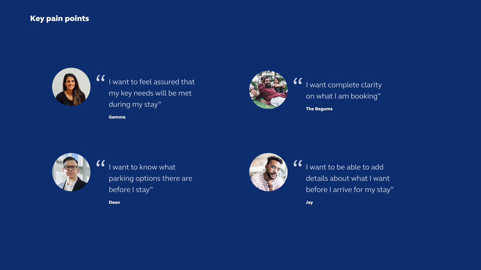
Then we conducted a user research to find the pain points. One of the major issues was a lack of clarity. Our research showed that even finding information on cleanliness and comfort was difficult because it was often scattered across several pages outside of the booking flow. Guests often felt forced to visit third party websites just to find reliable reviews. They couldn’t evefind simple things like parking options.
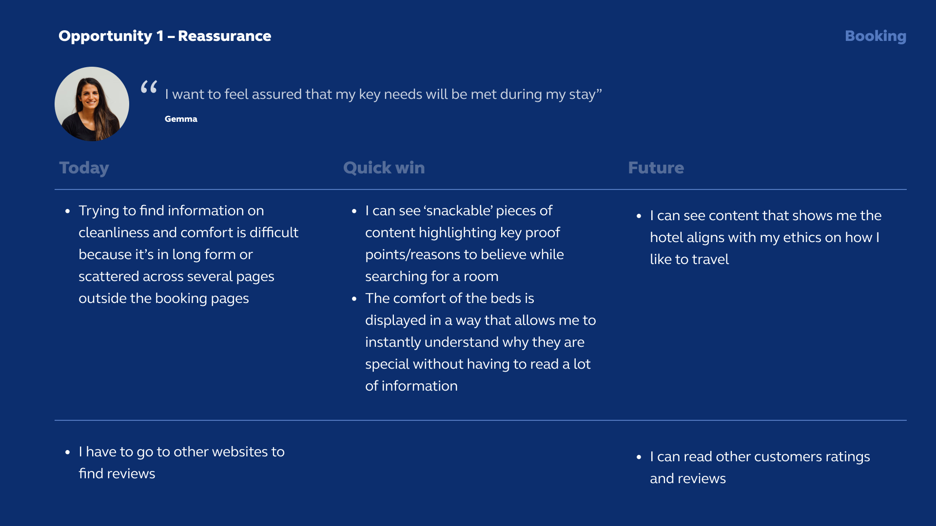
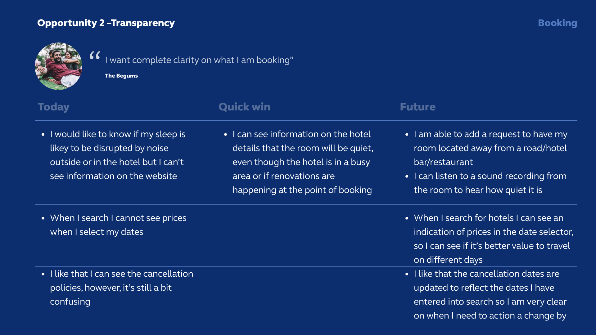
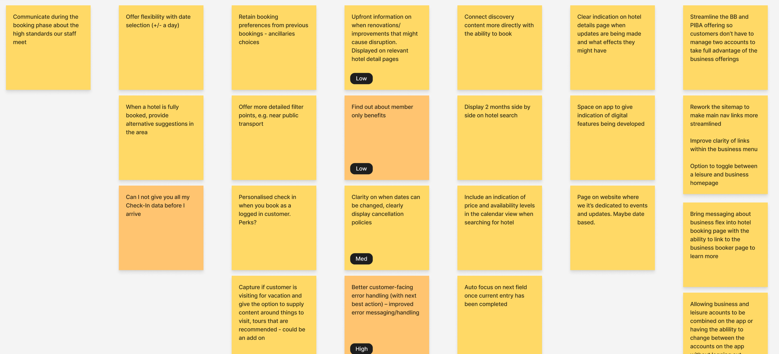
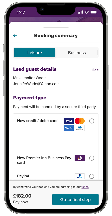
After we gathered the problem statements, we mapped out a range of possible solutions, both short term and long term. Since Premier Inn has been a very successful company, it was critically important to improve the experience without introducing many new features for customers. Instead, we reorganized the information architecture of the app to mirror the desktop site as the first step. We focused on consistency and making sure that the booking flow was seamless. Before implementation, we did A/B tested different variations with slight differences such as title sizes, button placements, colour coding, usability.
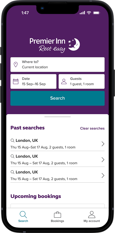
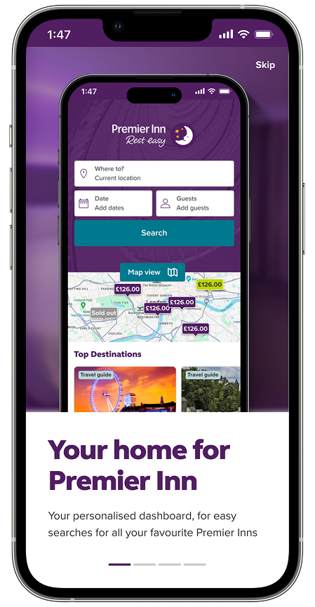
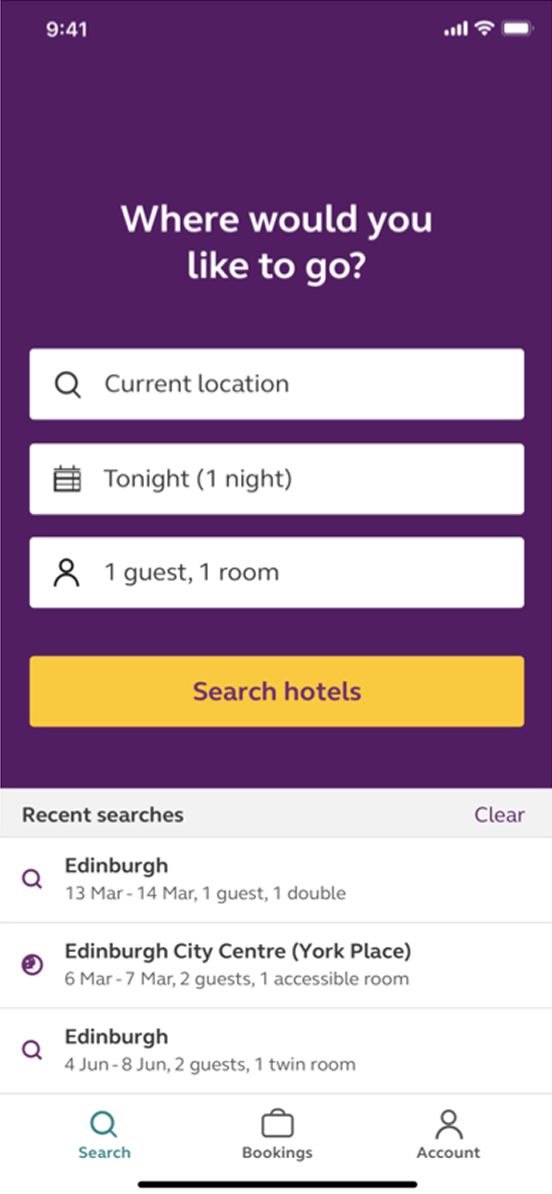
Removed the question above search bar and added brand logo to reinforce the branding.
Reduced the number of dropdown rows to 2 to increase the real estate.
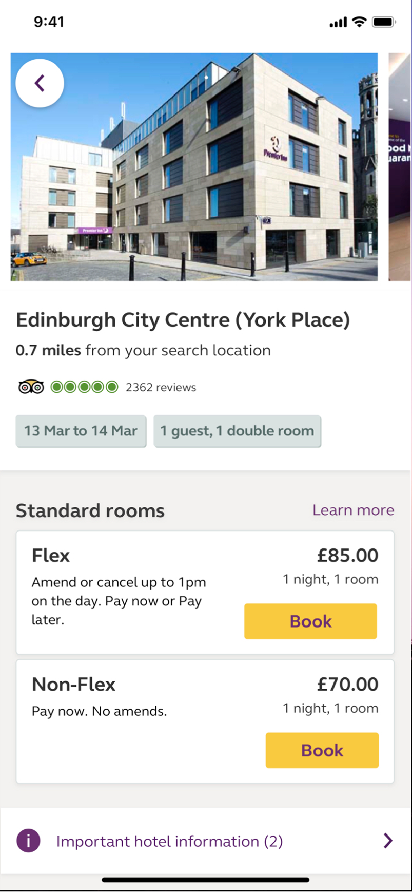
Changed conversion CTA to Primary Green to align with desktop experience
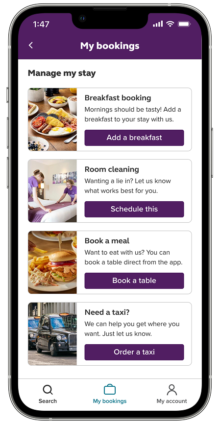
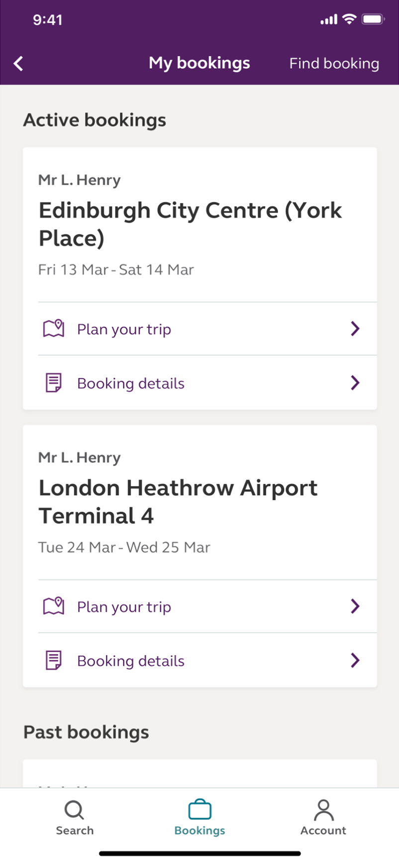
Added functionality to see upcoming bookings.
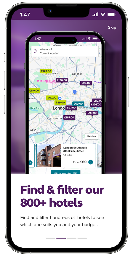
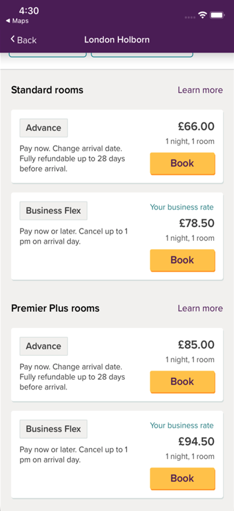
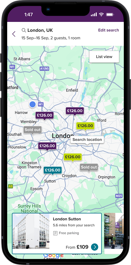
Color coded the sub-brands of Premier Inn such as Hub and Zip to reflect a more accurate result display.
Added parking indicator to avoid users from having random parking charges.
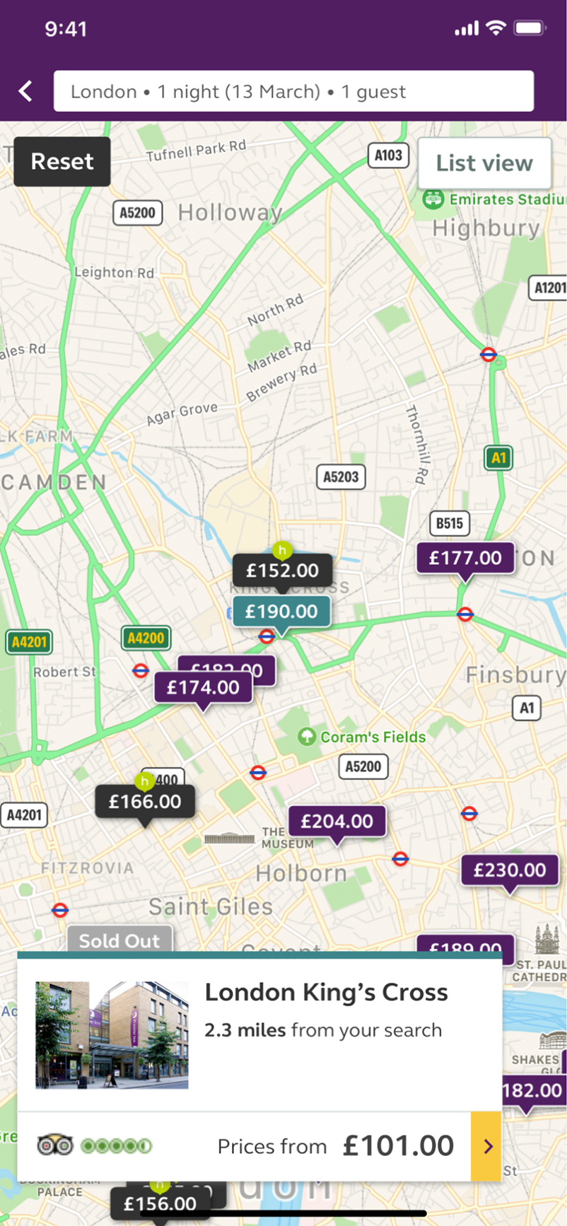
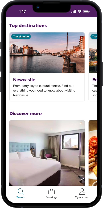
Included destination and discover cards to boost the upsell value on the mobile experience.
Introduced badges on cards to highlight the category of the content
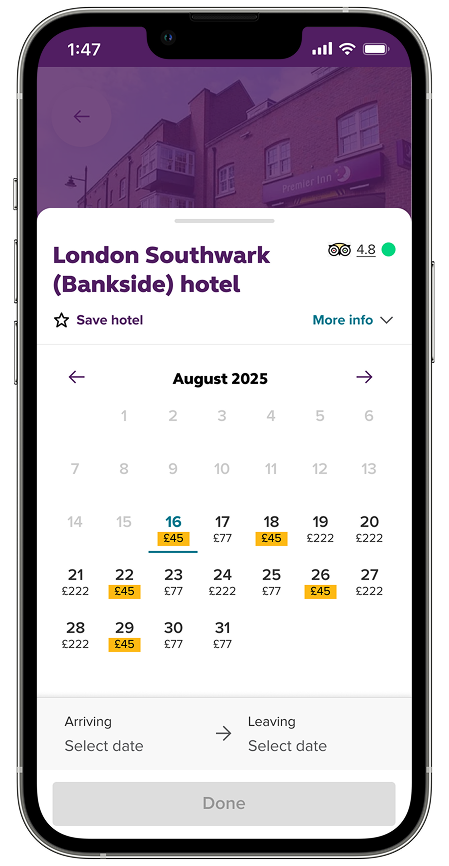
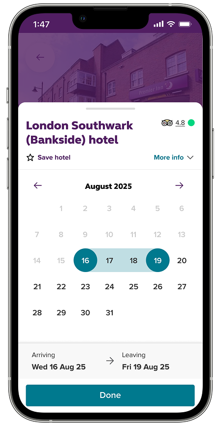
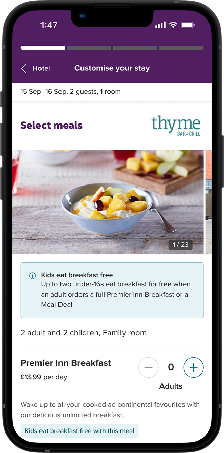
Added the progress bar to ensure that the customers are not lost in the process of booking.
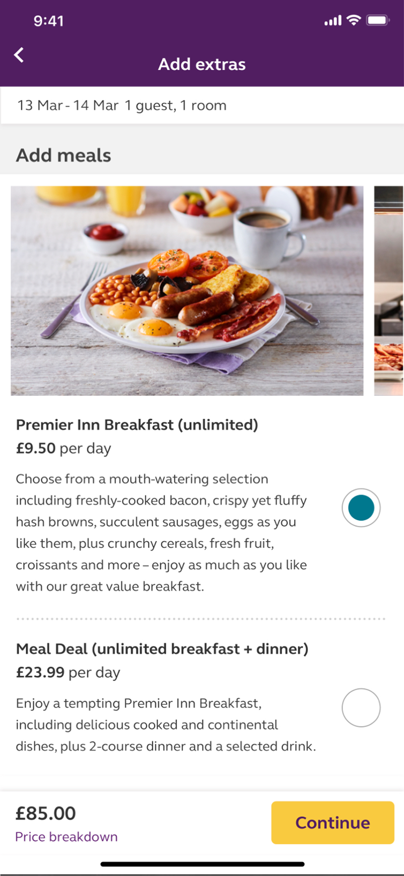
Added a notification to highlight the included services, so the customers would avoid double booking such as meals.
After the implementation, the booking completion on the app was increased by %15 and the users stated that the improved clarity of information and being able to relate with their desktop experience was the key reasons that they felt comfortable booking on their mobile phones.
By the end of my time at Premier Inn, I had created a unified design system in Figma for both the web and mobile teams and redesigned the mobile app to deliver the same experience as the desktop version, which Premier Inn customers were already accustomed to. Aligning the app and desktop ensured that any future updates to a component could be applied to both platforms at the same time. This system also helped prevent legacy, offline design decisions from introducing new inconsistencies. We rolled out the update in the UK and German markets, providing a cohesive journey for all travelers.
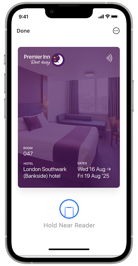
I also focused on the future vision and mapped out how the Premier Inn app might look like with increased and improved functionalities such as onboarding, price transparency, digital keys, apple pay integration, loyalty and suggested improvements and additions to current PI experience.