Premier Inn UK - Design System
Premier Inn UK - Design System
Product Designer / Lead UI Designer
Role
2021-2024
Duration
Design, Engineering, QA, Product
Team
Tools
Figma, Jira
When I joined Premier Inn in 2021, different teams were designing the same things in different ways. The website, the app, and the booking engine all had their own visual language and their own component libraries. In some cases, even the colour usage was inconsistent between digital and print. For users it meant a fractured experience. For the people building it, it meant slow cycles, constant rework, and no shared point of reference.
Over three years, I led the creation of a design system that gave every team working on Premier Inn's digital products a single foundation to build from.
Changing how teams worked together
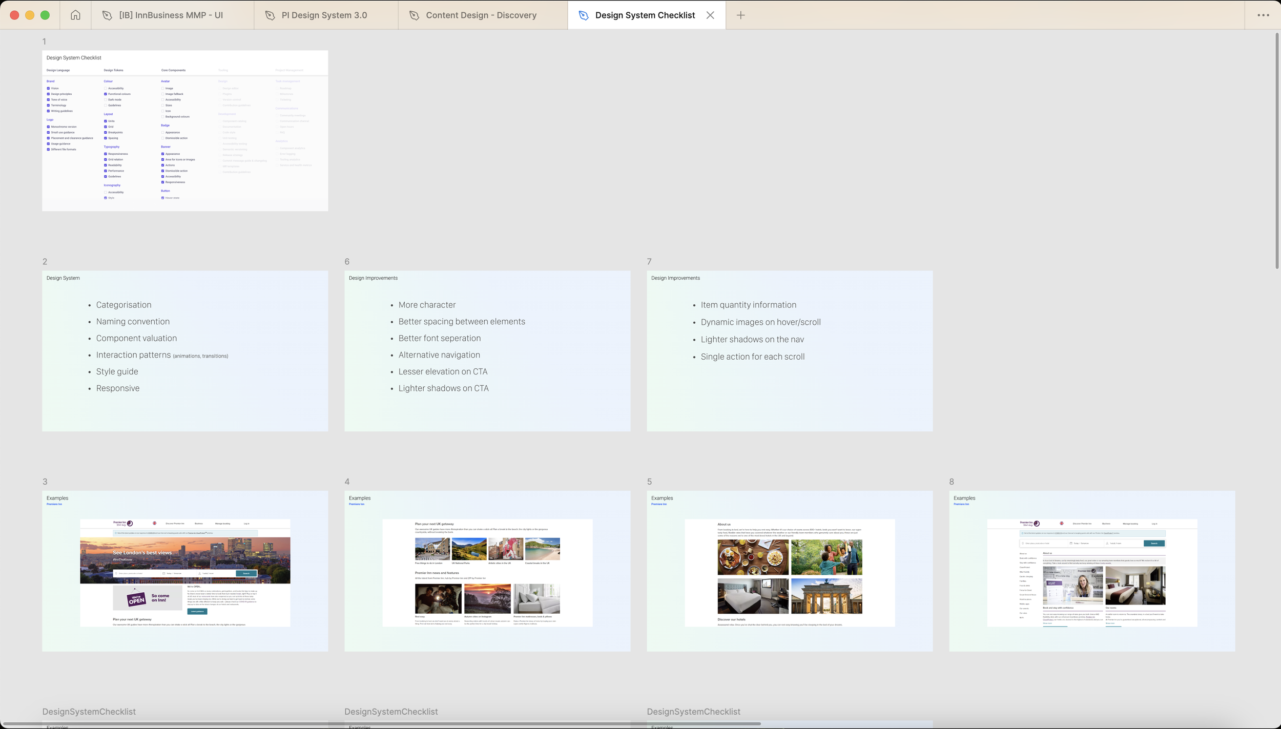
One of the first practical moves was shifting the entire design operation to Figma. This is a tooling decision on the surface, but it changed the working culture. Designers, developers, and product managers could look at the same file at the same time, which cut out a lot of the miscommunication that happened across handoffs.
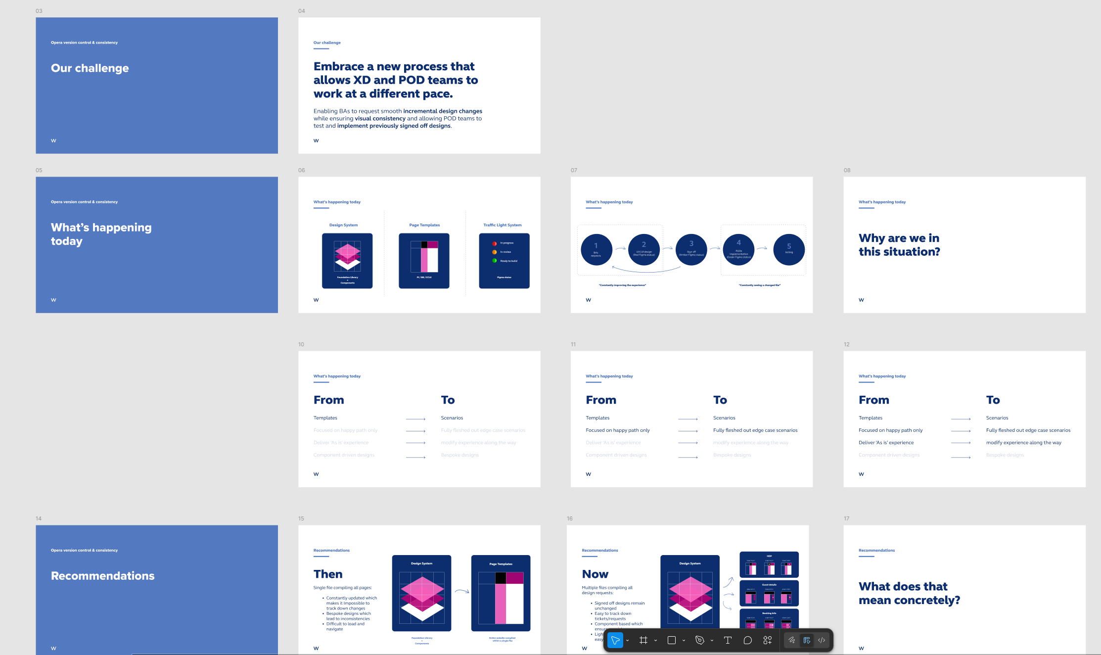
I also integrated the design workflow into JIRA so that business analysts could request changes through a proper, trackable process. Version history became visible to everyone, and QA teams always knew which designs were signed off before they started testing.
Building the system
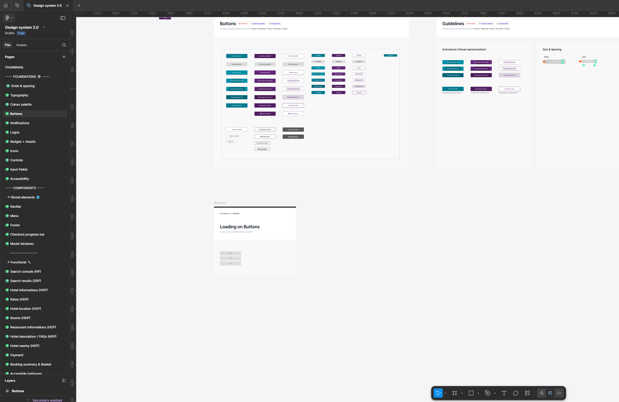
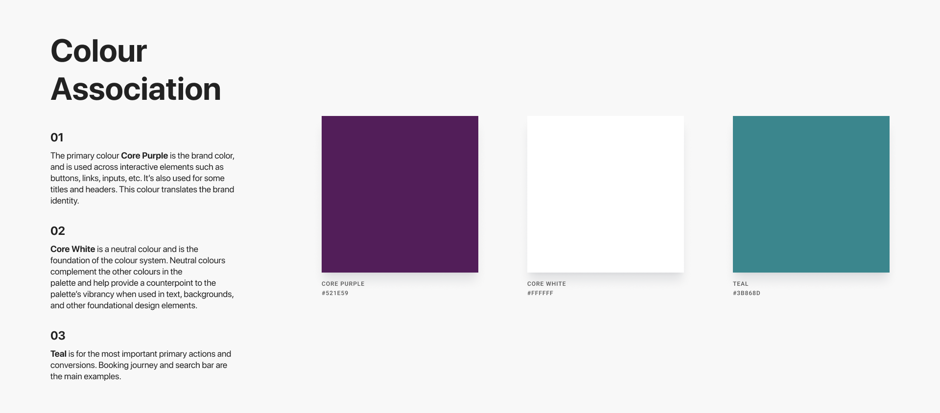
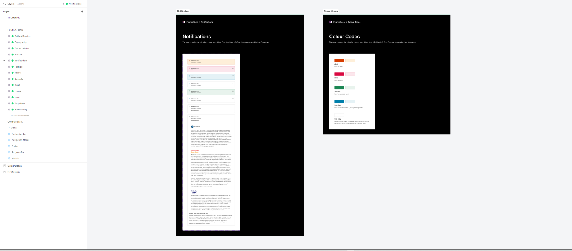
I built the system on atomic design principles, starting with the foundations that everything else sits on top of. This covered grids and spacing across six responsive breakpoints, a full typography scale with regular, bold, semi-bold, and AEM-specific variants, and a colour system that separated primary brand colours, marketing colours, notification states, sub-brand palettes, and interactive states like button colours and overlays.
The colour work alone took significant time. Premier Inn operates multiple brands under one roof: the main Premier Inn leisure product, hub by Premier Inn, Zip by Premier Inn, and Business Booker for corporate customers. Each needed its own colour treatment within a system that still felt coherent. I documented every colour token, what it meant, where it should and shouldn't appear, and how it behaved across different contexts and backgrounds.
Buttons went through the same level of detail. I designed the full set of states across primary, secondary, tertiary, and generic variants, at default and small sizes, covering enabled, hover, focused, and disabled states. On top of that, I built animation guidelines that defined how button interactions should feel and move, with visual documentation that engineering could reference directly.
Components
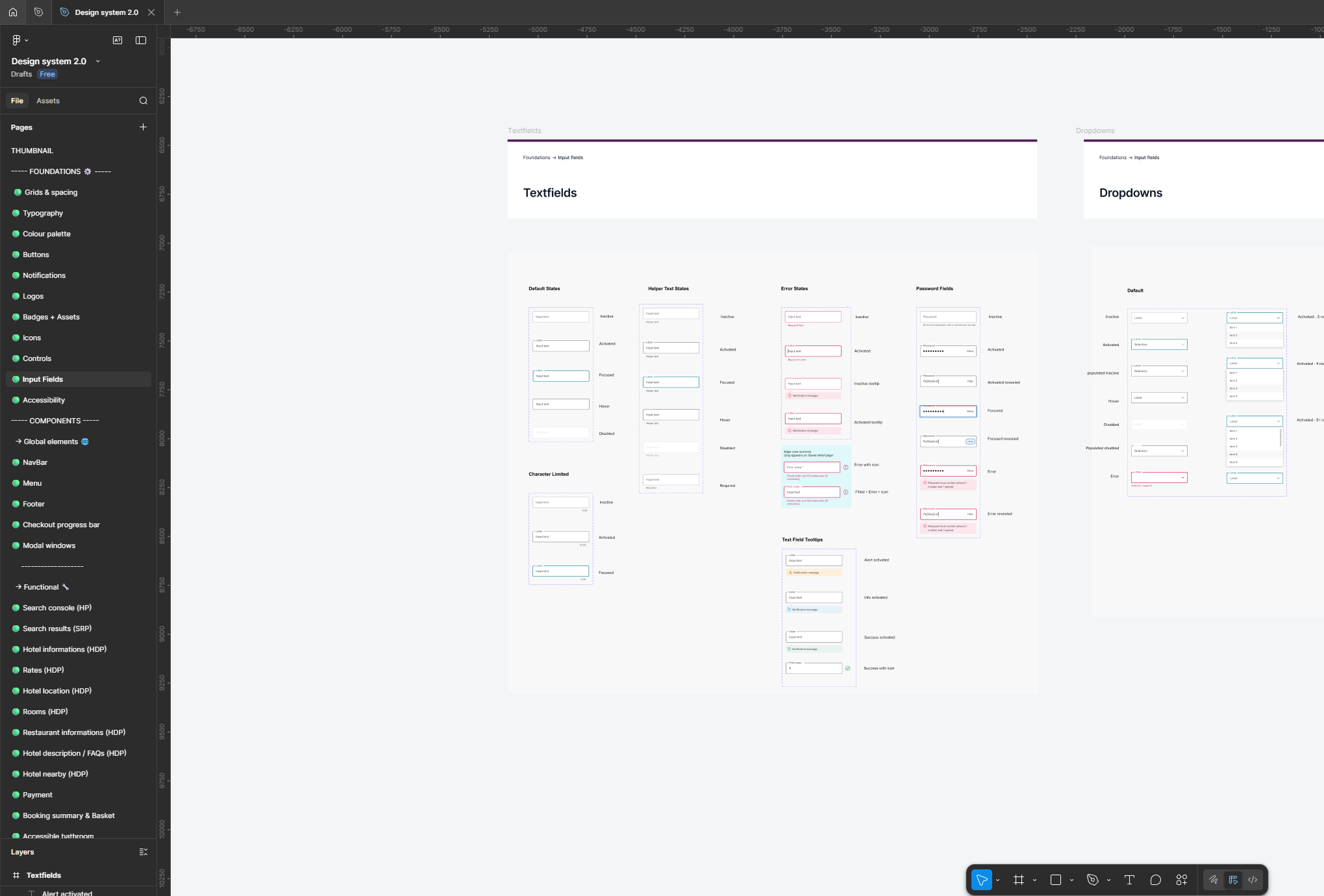
Once the foundations were in place, I built the component library on top of them. This covered notifications and alert states, tooltips, form controls including text fields, dropdowns, date pickers, address fields, and card inputs, icons, logo variants across all sub-brands, and interactive controls including accordions, carousels, tabs, toggles, breadcrumbs, and radio selections.
Every component was built to cover its full range of states and responsive behaviour. The input components alone covered textfields, card inputs, date selection, address lookup, active alert states, and error handling, each documented with spacing specifications and margin guidelines so engineering had no ambiguity when building them.
Functional templates
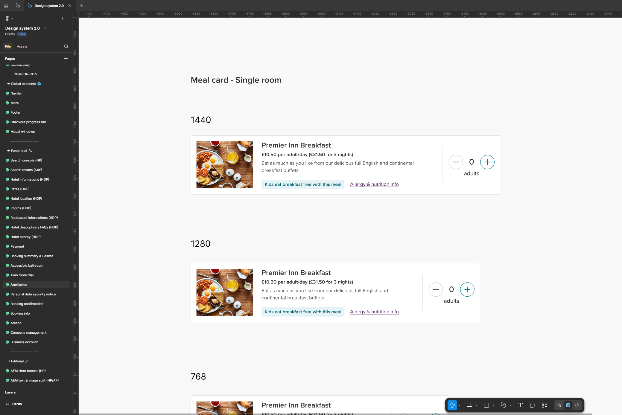
Above the components sat the functional layer: full page templates built from the component library, covering every major step in the Premier Inn booking journey. This included the search console, search results, hotel information pages, rates across leisure and business bookings, rooms, restaurant information, hotel location, nearby hotels, payment, booking summary and basket, booking confirmation, amendments, ancillaries like meal and extras cards, and accessible bathroom configurations.
Each template was designed across all six breakpoints: 1440, 1280, 768, 576, 375, and 320. And because Premier Inn runs multiple brand variants, many templates were built in separate versions for Premier Inn leisure, hub, Zip, Business Booker, CCUI, and the German market.
Working with engineering
The biggest ongoing challenge was closing the gap between what was designed and what got built. Interactions and animations are easy to get wrong in development, especially when the documentation isn't precise enough to remove interpretation. I worked directly with the engineering team through a series of design and engineering bootcamps where we went through components together, tested built versions against the design specs, and iterated until the behaviour matched. This meant going back and forth repeatedly on individual interactions until the timing, easing, and states were right. It added time to the process, but it meant the system that shipped was actually the system that was designed.
Supporting the replatforming
The timing of the design system work mattered. Premier Inn was migrating from its legacy in-house platform, Bart, to Opera at the same time the system was being built. Having a structured, documented component library meant the migration could move at pace without the visual experience deteriorating in the process. New pages could be assembled from existing components rather than designed from scratch, and the consistency held across the transition.
Getting people to use it
Building a design system is one problem. Getting an organisation to adopt it is a different one. I ran workshops across the business to train teams on the new tools and processes, and to make the case for why the consistency was worth changing how they worked. Different departments had different priorities, and getting everyone onto the same foundation required patience and ongoing negotiation. But by the end of three years, the system was genuinely embedded in how Premier Inn builds its digital products.