Product Designer
Role
2025-2026
Duration
Product, Engineering, QA, Marketing
Team
Tools
Figma, Jira
The brief
Holland & Barrett were running a four-day promotional campaign called Wellness Day Sale, with exclusive daily offers available to customers. Driving traffic on day one is the easy part. The harder problem was getting people to come back on day two, day three, and day four, and actually redeem what they found.
A standard promotional banner or email doesn't do that. People see it once, maybe use the code, and move on. The brief was to design something that gave customers a reason to return every single day for the full duration of the campaign.
The thinking behind the mechanic
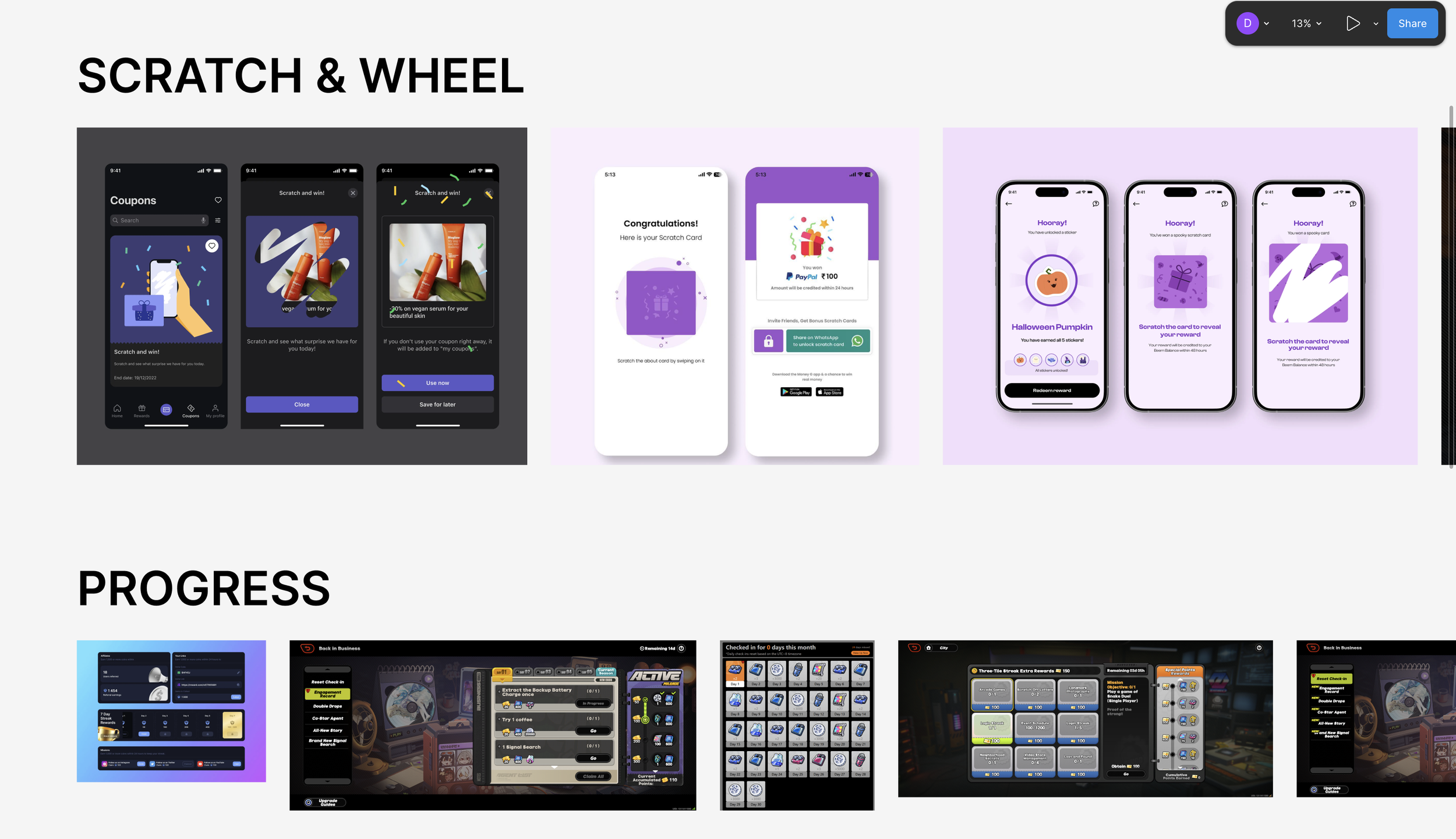
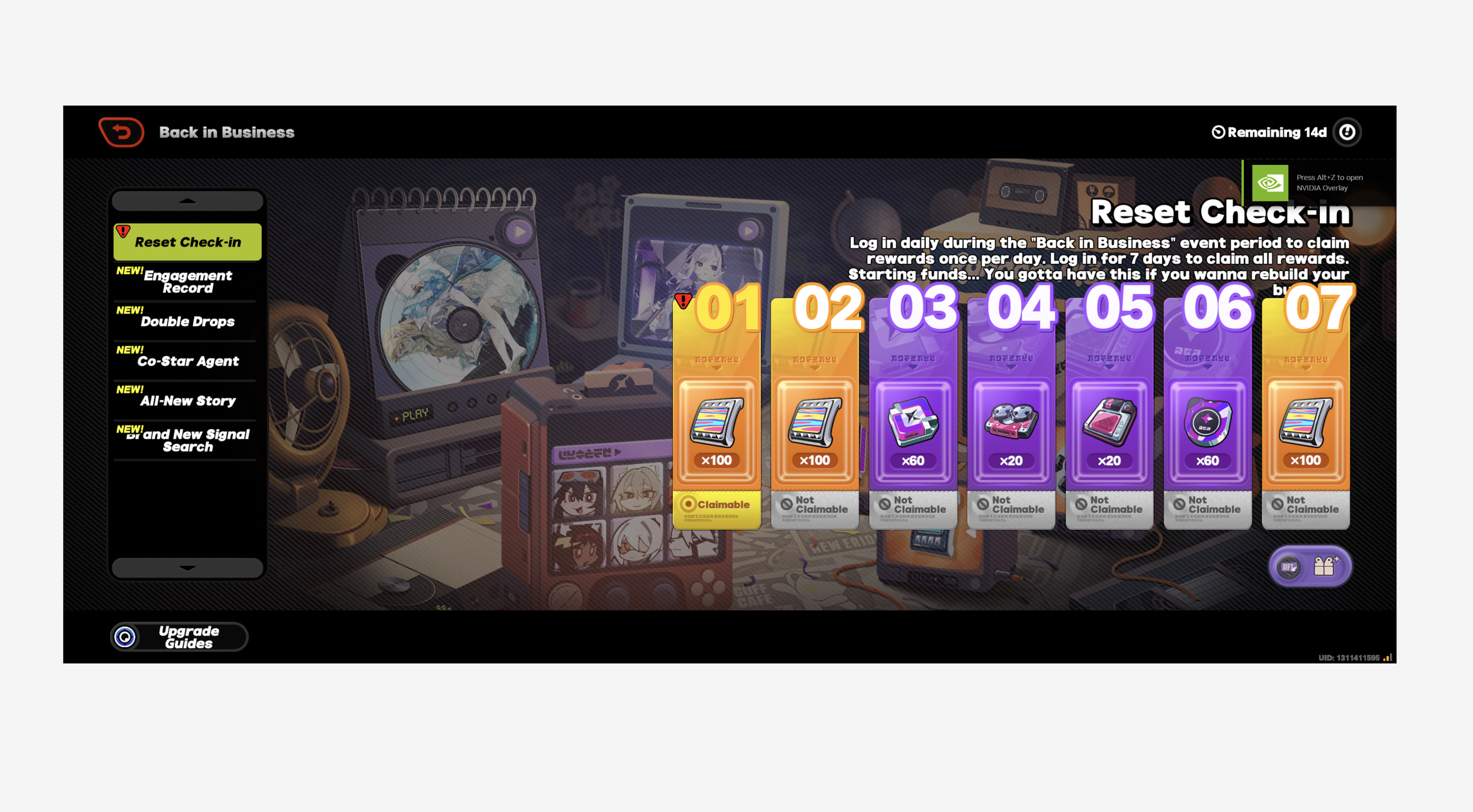
The solution I landed on was a scratch card mini-game embedded directly into the Holland & Barrett website, designed for both mobile and desktop. I drew the core mechanic from daily reward systems in mobile gaming, specifically the gacha loop where players return each day to unlock a new reward. That loop works because the next reward is always visible but always locked. You know something is waiting for you tomorrow, which pulls you back.
Applied to a retail context, it meant each customer had four scratch cards, one per day, that they could only unlock on the correct day. Day two's card was visible on day one but locked. That visibility mattered. A vague promise of more offers to come is easy to dismiss. A locked card sitting on your screen is not.
Concept 1: Single card
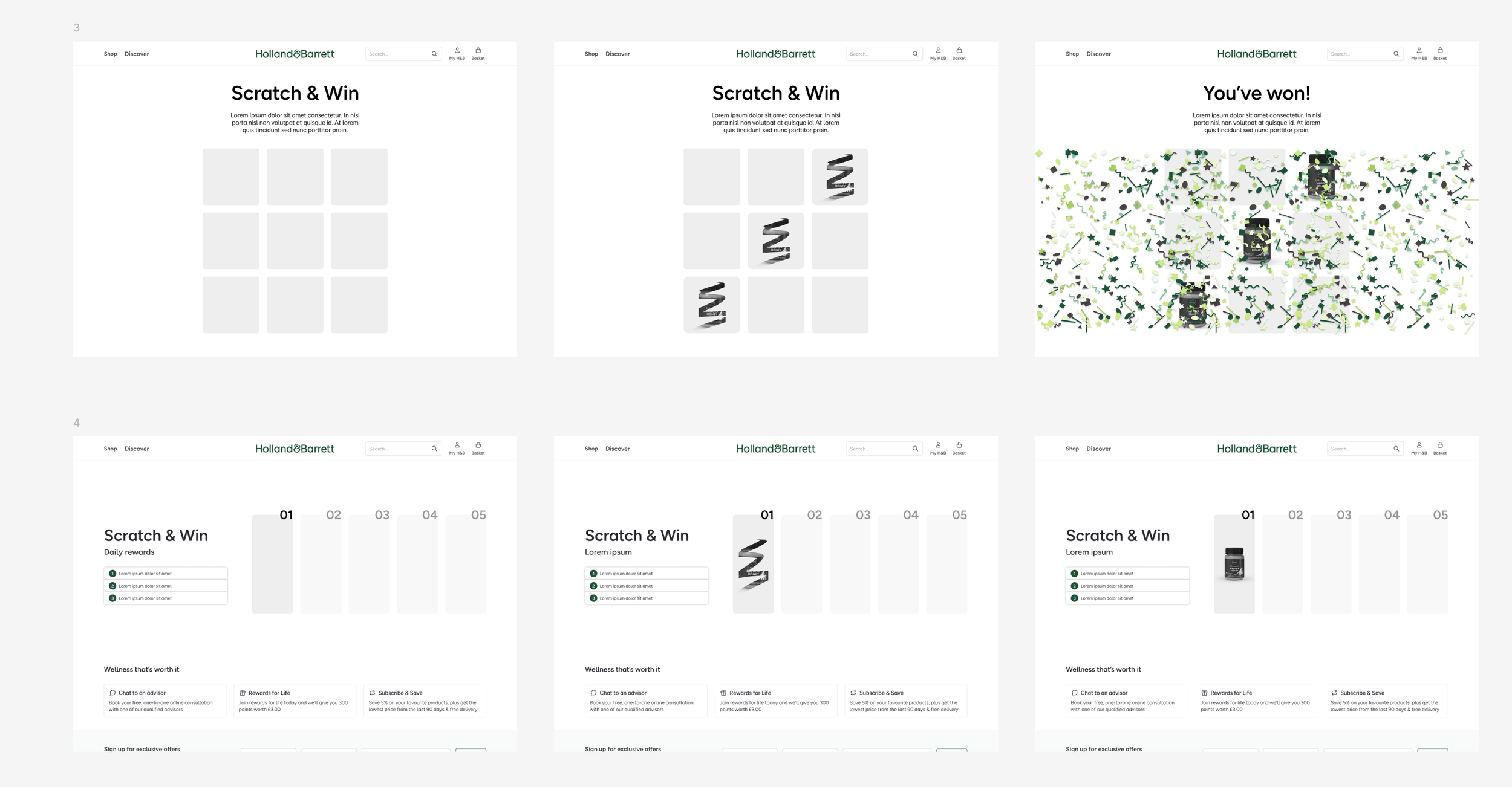
The first direction was a single large scratch card per visit with the product reveal behind it. Clean and simple, but it didn't solve the return problem well enough. One card, one visit, nothing pulling you back tomorrow.
Concept 2: Scratch grid
The second direction used a grid of tiles that made up a single scratch area, revealing the prize progressively as you scratched. More engaging as an interaction, but the added complexity felt disproportionate to the reward.
Final direction: Daily card track
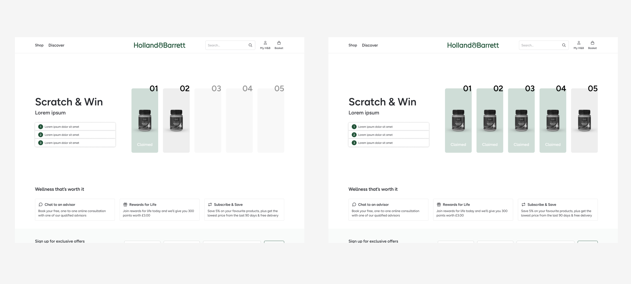
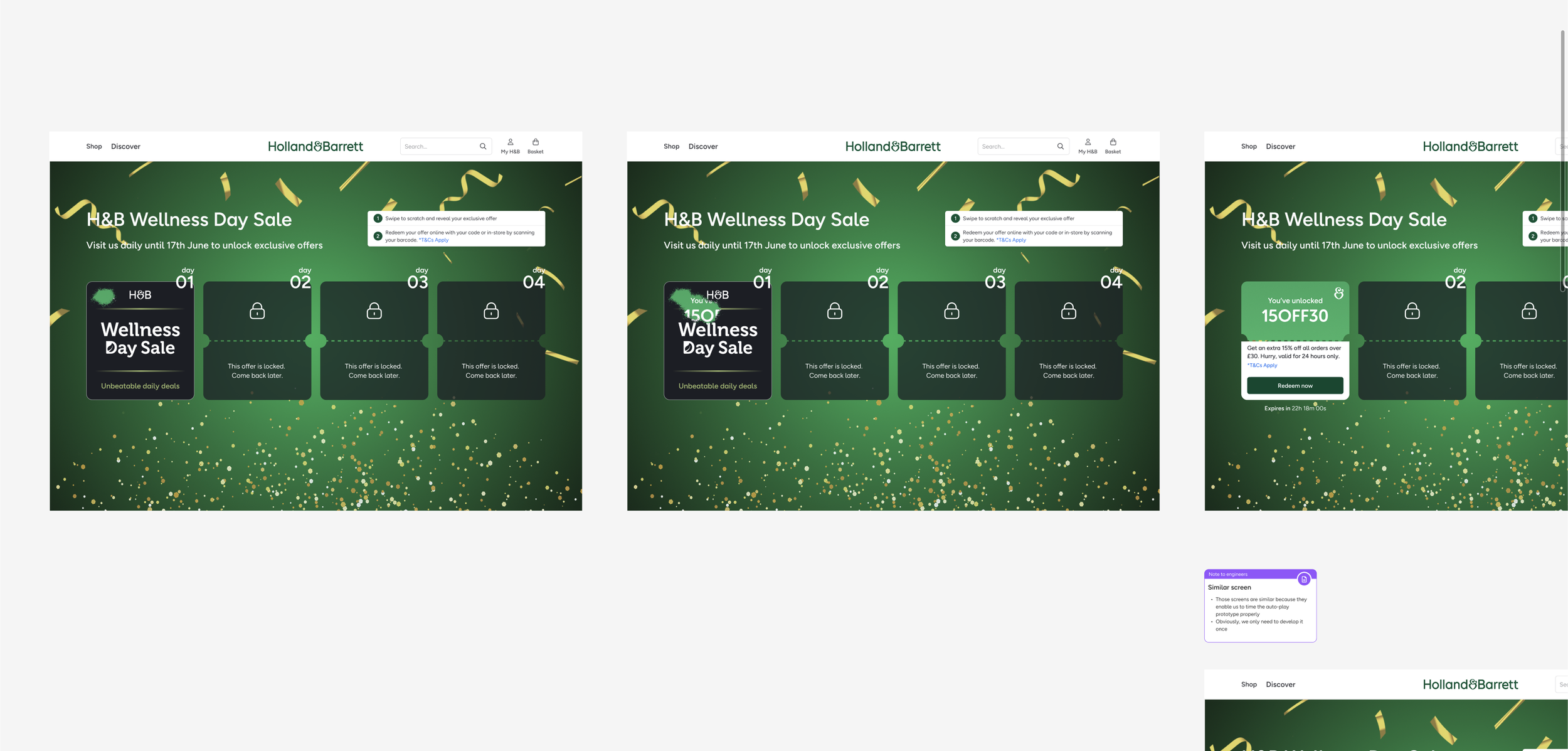
The direction that worked was a numbered card track showing all five days across the top of the screen, with the current day's card active and the rest locked. It made the daily structure immediately obvious and gave users a sense of progress across the campaign. Claimed cards showed a clear confirmed state, so coming back the next day felt like continuing something rather than starting over.
Fitting into the H&B site
The mechanic needed to live inside the existing Holland & Barrett website, not on a standalone campaign page. That meant working within the constraints of their navigation, footer, typography, and brand palette rather than designing a self-contained experience from scratch.
Staying on brand
The scratch interaction and the card states all had to feel like a natural extension of the H&B brand. The green and white palette carried through, the typography stayed consistent with the rest of the site, and the product imagery used in the prize reveals came from the existing catalogue. The goal was for a customer to land on it and feel like it belonged, not like a third-party promotion had been dropped into the page.
On entering the campaign, customers were greeted with a brief explanation of how it worked: visit daily, scratch your card, unlock your exclusive offer. The onboarding was intentionally short. The mechanic is familiar enough that most people don't need much instruction.
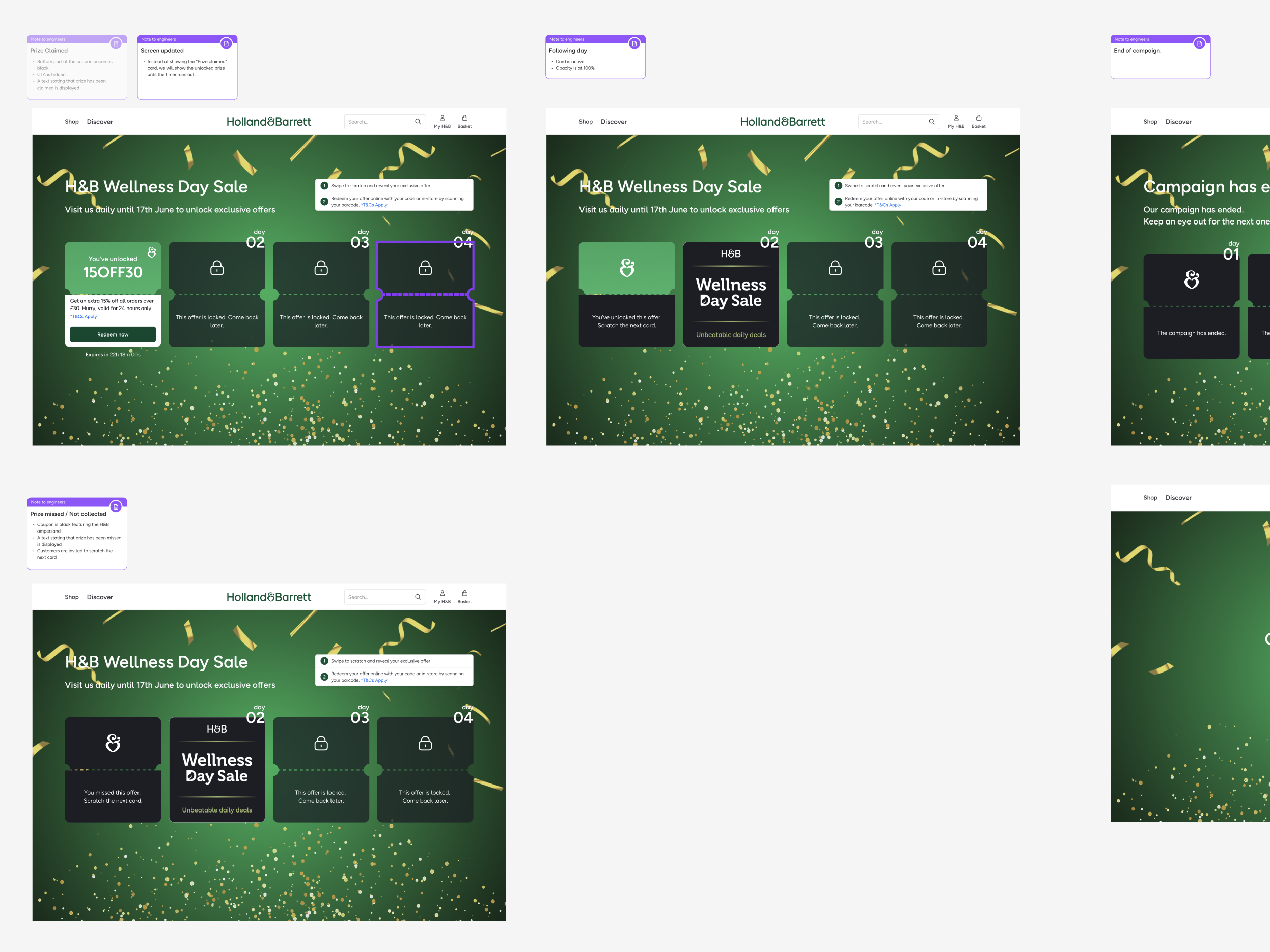
Scratching the card revealed a discount along with a unique code and a 24-hour redemption window. The time limit served two purposes. It created urgency around actually using the offer, and it reinforced the daily rhythm of the campaign rather than letting people stack codes and redeem them later.
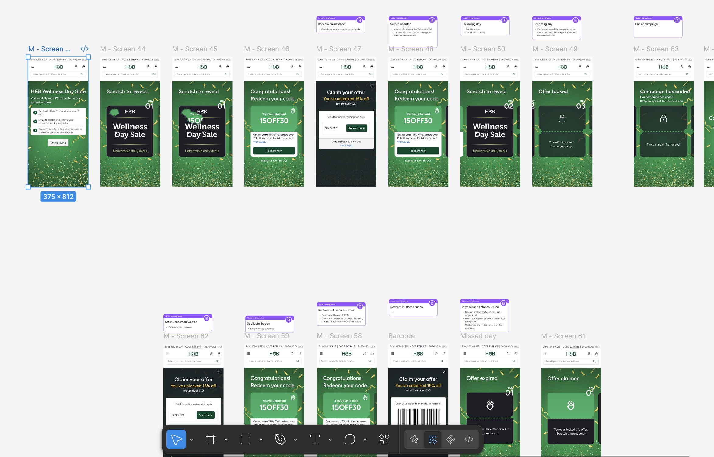
Redemption worked two ways. Online, customers copied the code at checkout. In-store, the screen generated a barcode they could scan at the till. Having both options in the same flow was important for a retailer with over 1,000 physical stores. A campaign that only worked digitally would have excluded a significant portion of H&B's customer base.
I designed the full set of states the experience needed to handle: the scratch interaction, the offer revealed, the locked state for future days, the missed day where an offer had expired unclaimed, the barcode view, the offer already redeemed confirmation, and the campaign ended screen. Getting these edge cases right was where most of the detail work happened, because a user hitting a confusing state on day three is a user who doesn't come back on day four.
The outcome
The design created a structured reason to return on each day of the campaign, with enough friction removed from the redemption step that using an offer required minimal effort once unlocked. The dual redemption path, code online and barcode in-store, meant the campaign could work for H&B's full customer base regardless of how they prefer to shop.